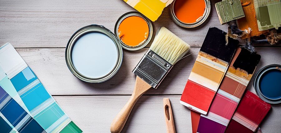
Painting Emotions
The art of interior design involves fusing a person’s interests and personality to produce a meaningful portrayal of their inner self. It’s like a blank canvas that we color and embellish with subtle details like glass, ceramics and woodwork. We combine them all to give residential and commercial properties a logical and organic flow. While imagination plays a major role in interior design, we also need to consider the effects of the color schemes we choose. To understand the effects of colors in Home Dedcor, this article sheds light on important facts with examples.
- Red
Emotions associated with the color red: Joy, Love, Passion, Desire, Sexuality, Energy, Power, Strength, Leadership, Courage, Anger, Danger, etc.
Where can it be applied? : Office buildings or home offices, in the living room, and in the bedroom
The most vivid hue that fully captures the range of emotions is red. When it comes to evoking strong feelings, red is one of the coloring book’s most alluring and dramatic colors. It frequently goes hand in hand with emotions like ardor, enthusiasm and vigor. Whether they are light ham red hues or dark maroon, they all combine to give a feeling of love and friendship. Using red in your design schemes gives the space a sense of vitality and enthusiasm. Red can be a productive choice for home offices and creative spaces.
- Black
Emotions associated with the color black: Functionality, Simplicity.
Desire, Protectiveness, Depression, Untidiness, Elegance, Modernism, Boldness, Beauty, etc.
Where can it be applied? : Kitchen, living room, dining area, and bathroom
Black has long been a sophisticated and versatile color. Black is a color of practicality and simplicity. Modern architecture and interior design benefit greatly from the use of this hue.
An all-black space can be intimidating and depressing psychologically. But the color makes a striking contrast whether used with red, white, blue, or practically anything else. Although it is a well-proven accent color, its psychology lends power, drama, and mystery to a room when applied extensively.
- Pink
Emotions associated with the color Pink: Sweetness, Warmth, Comfort, Love, Compassion, Nurturing, Romance, Glamour, Feminism, etc.
Where can it be applied? : Bedroom (Teenage Girls), Living Room, Bathroom
Pink has an impact on sentiments that are closest to the heart. In terms of color psychology, pink is a delicate shade that represents femininity, love and nurturing. Its soothing tones make it a favorite for bedrooms, but with careful application, it may as easily be incorporated into living room designs. Though it is a highly misjudged color for teenage girls, it can also be applied to give a masculine effect. Give it a mature look by choosing furniture with timeless, fuss-free designs and energizing patterns. Pink may be used in modern interior design trends in a whole new way with elegant and simple patterns.
- Blue
Emotions associated with the color Blue: Calm, Tranquility, Control, Bliss, Softness, Knowledge, Wisdom, Intelligence, Power, Seriousness, Healing, Prosperity, etc.
Where can it be applied? : kitchen, playroom, bedroom, and dining room
One of the most soothing color schemes for interior design is blue. When it comes to color’s psychological benefits, blue calms the mind and lowers blood pressure, heart rate, metabolism, and hypertension. Particularly, aquatic hues of blue, including light and sky blue, are calming to the psyche. It makes people think of the ocean or swimming pools. The only hue that provides a wide range of psychological benefits and little to no psychological drawbacks is blue.
- Purple
Emotions associated with the color Purple: Elegance, Luxury, Richness, Sophistication.
Drama, Depth, Excitement, Creativity, Mystery.
Where can it be applied?: dressing rooms, walk-in closets, in-house art studios, and the kitchen
According to color psychology, purple is linked to a wide range of amazing emotions, including depth, creativity, fantasy, and nobility. Deeper tones of the color might be rather manly, but it looks great in feminine settings like this lovely bedroom design. Purple color choices are ideal for spaces that encourage design and innovation. Vibrant purple tones like plum or violet give your design concept personality. Lighter purple hues, like mauve and lavender, on the other hand, give your design a serene yet majestic feel.
- Yellow
Emotions associated with the color Yellow: Joy, Happiness, Care, Intelligence, Excellence, Obedience, Energy, Freshness, Optimism, Encouragement, etc.
Where can it be applied?: kitchen, dining areas, hallways, and bathrooms
Yellow is often associated with sunshine, which helps to promote happiness and light. Because yellow is closely related to the color gold, it is also connected to intelligence and wealth. People’s moods are instantly lifted by the hue, which makes the space feel airy and cheery. Using yellow in its brighter tones is ideal for use around the house. Although it is a fresh color and arouses happy feelings, excessive use of it can cause higher blood pressure levels. Because the brain links elevated blood pressure to anger, people might become irrationally angry without any external trigger.
What Color Do You Want?
There is a vast body of research in color psychology that is directly related to interior design. The right color scheme can significantly impact the lives of the occupants of a building, whether it is residential or commercial. Use color schemes that your clients find comfortable because interior design is really a reflection of their personality. Pastel or vivid paint colors have an effect on the space you design as an interior designer.